Designing map elements for equity.nyc.gov
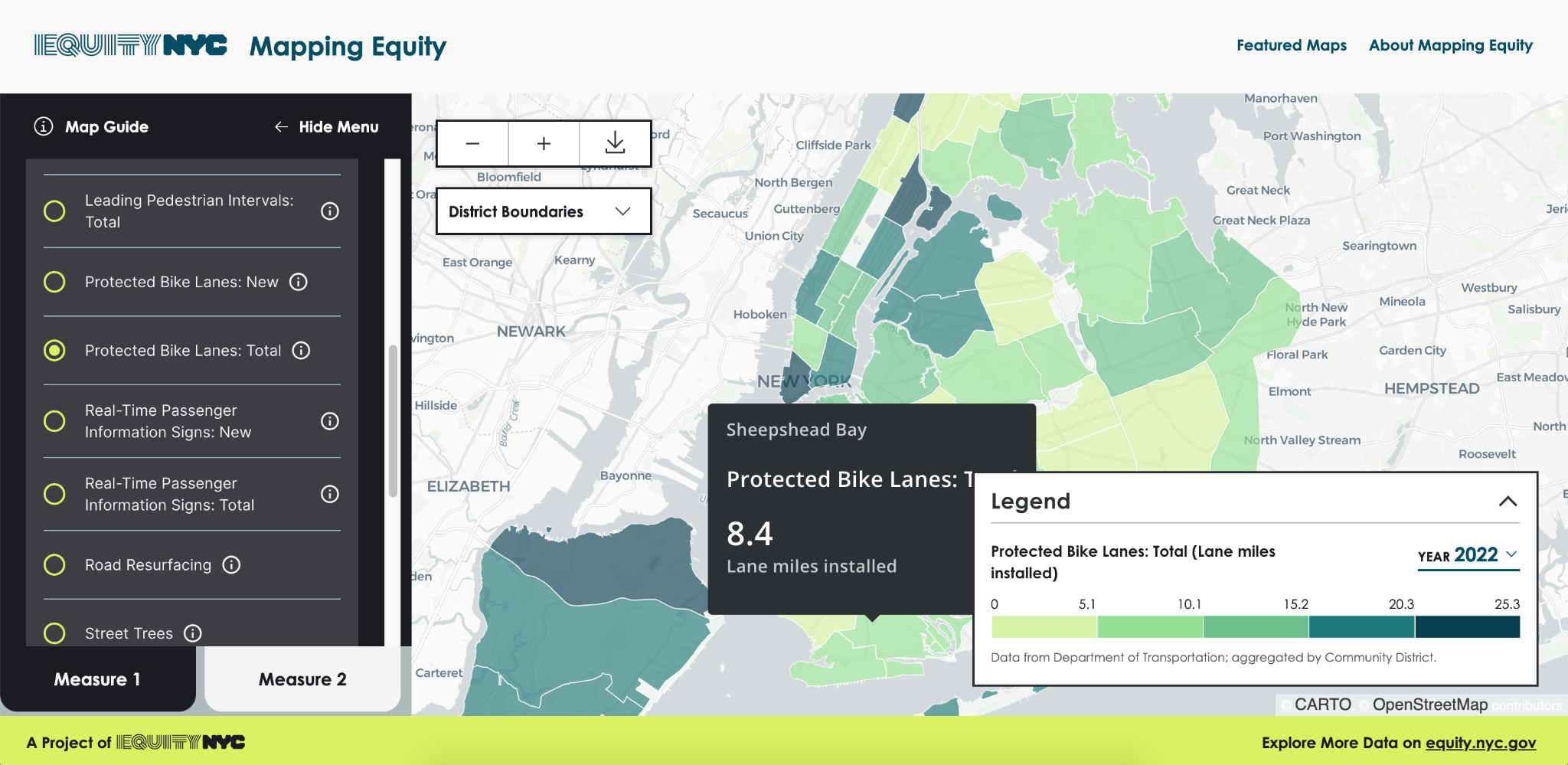
Equity.nyc.gov highlights NYC's progress on increasing equity across multiple indicators. In 2022, the team developed a “Mapping Equity” tool to show their data on a map.
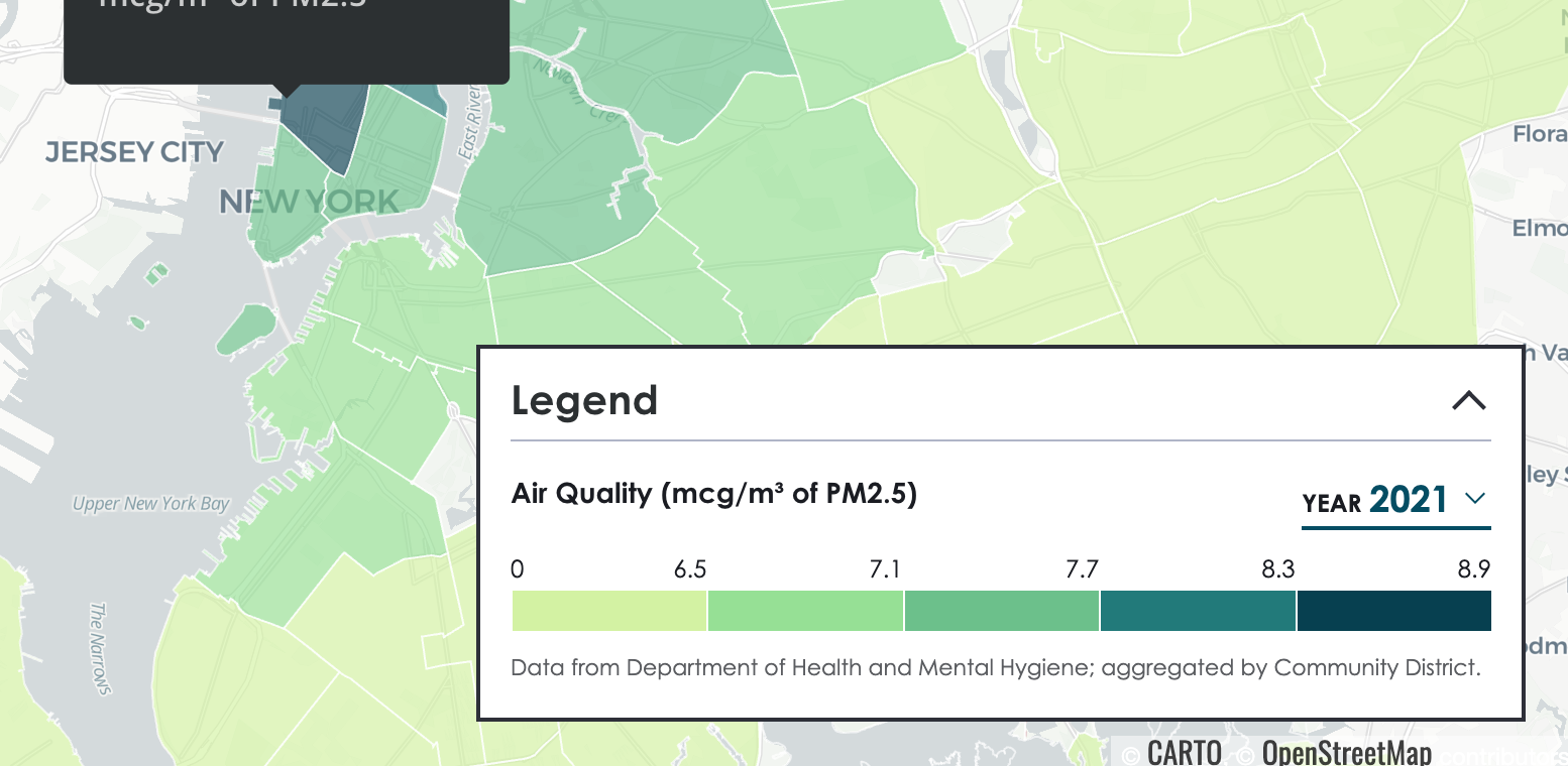
My challenge was designing tooltips that distilled the most important data.
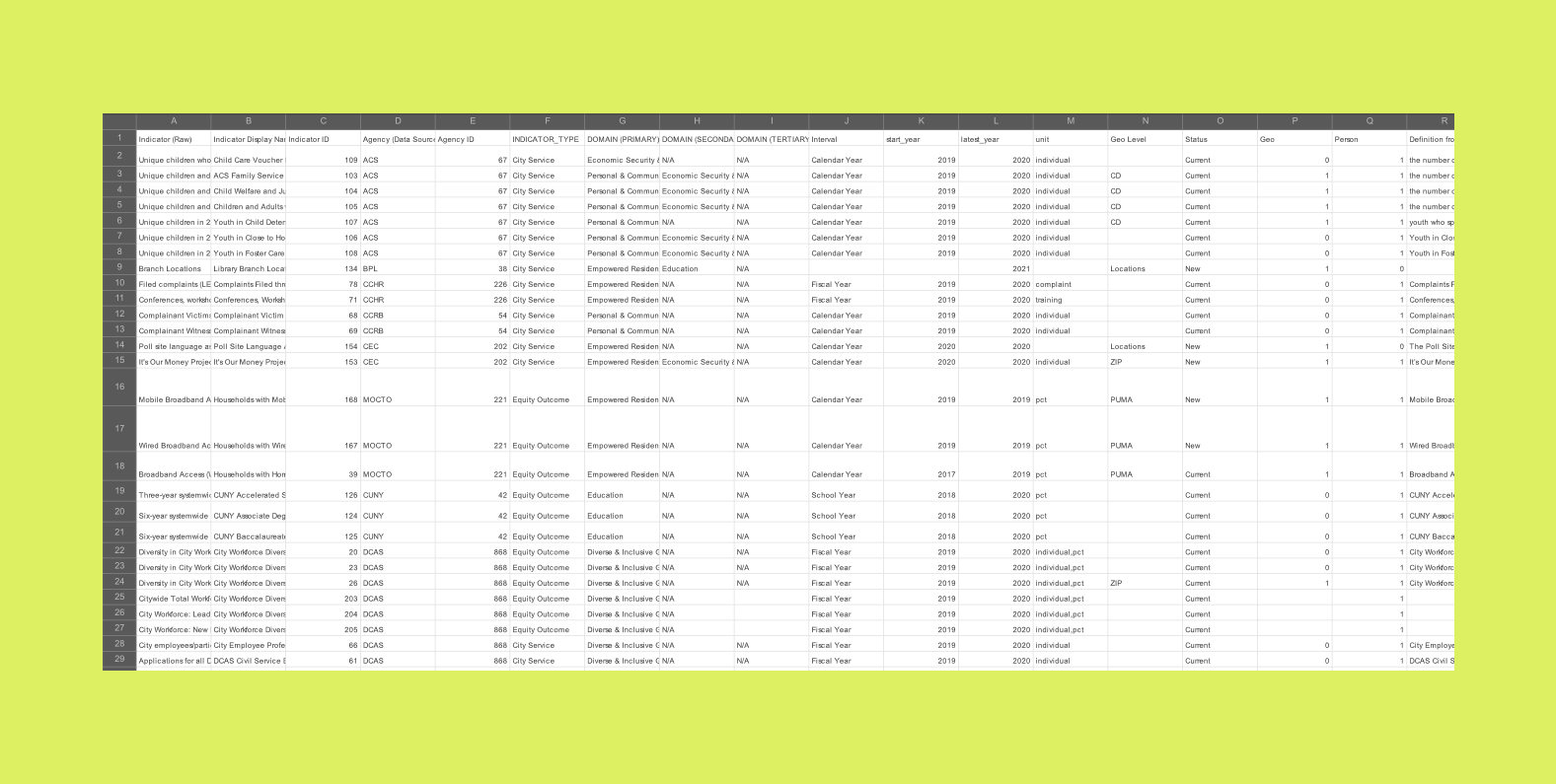
Every year, the Equity NYC team collects data from dozens of agencies and presents it for a public audience.
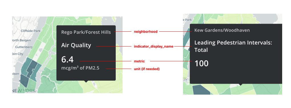
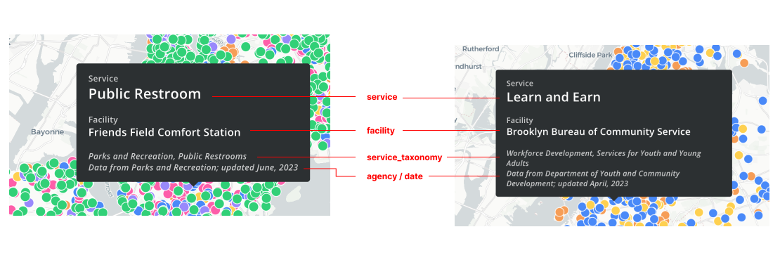
When designing for the Mapping Equity release, I sorted through the data to identify key information that we could pull into tooltips on the map. I worked closely with the data scientists to create custom data fields for the tooltips.
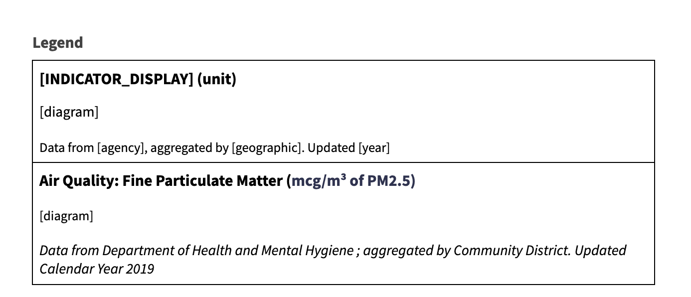
I created reusable templates for tooltips and legends on the map.
These templates are designed to ingest data for every indicator and present them with enough context.
For example, some indicators are meaningless without a unit (like Air Quality) while other indicators can do without a unit (like Leading Pedestrial Intervals).
I made low-fidelity wireframes to map which fields appear on which parts of the tooltips and maps. These helped communicate to engineers how data should be ingested.
Post a comment