Redesigning the information architecture of jobs.nyc.gov
Context
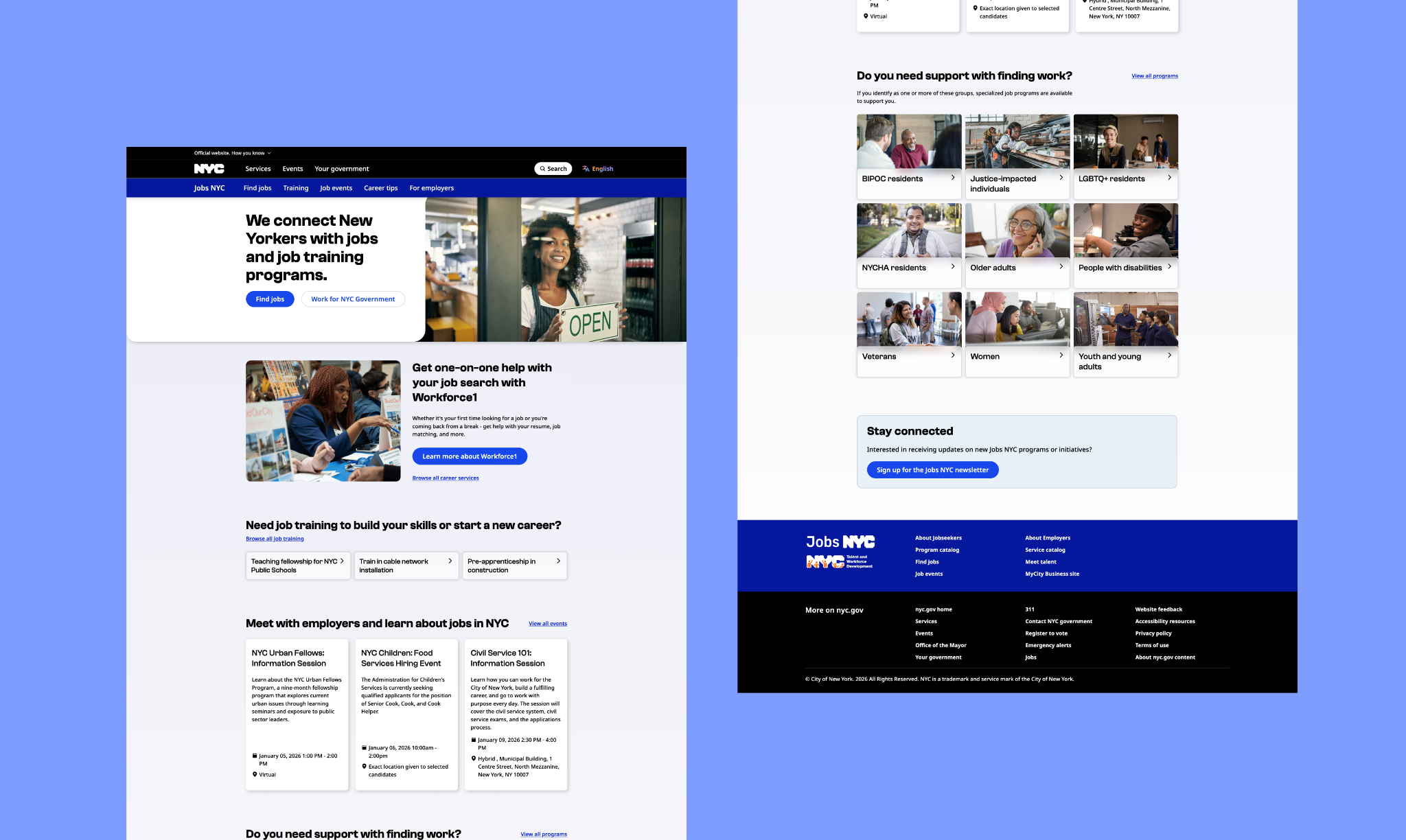
Jobs NYC connects New Yorkers to jobs, training, and career services.
In the Fall of 2024, my team at NYC Opportunity kicked off a redesign of the existing Jobs NYC site. I led the content vertical for the redesign and focused on clarifying the information architecture, working alongside a content strategist and a UX designer.
I interviewed executive stakeholders to clarify what the site's goals were.
I identified these key business priorities that drove how I prioritized content:
- increase clicks to the site's job board
- increase enrollment in hiring events
- increase sign-ups for the city's primary career service, Workforce1
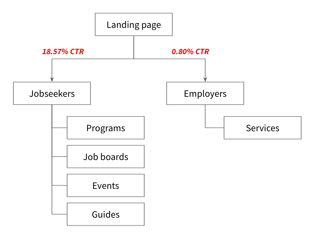
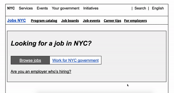
Users were getting stuck on the existing landing page.
The City of New York ran ad campaigns for Jobs NYC, driving hundreds of thousands of visitors to the site. However, the landing page was ineffective at funneling users to the next step. I analyzed the site's analytics within a three month period and learned that only 18.57% of our primary target audience was moving on to the next step.
There was duplicative content throughout the site, posing an opportunity to consolidate content.
The site owners (Mayor's Office of Talent and Workforce Development) didn't have clear guidance on how to prioritize new content on the site. This meant they often added content to multiple parts of the site in order to "increase visibility". It got to the point where two primary pages along the funnel had similar content.
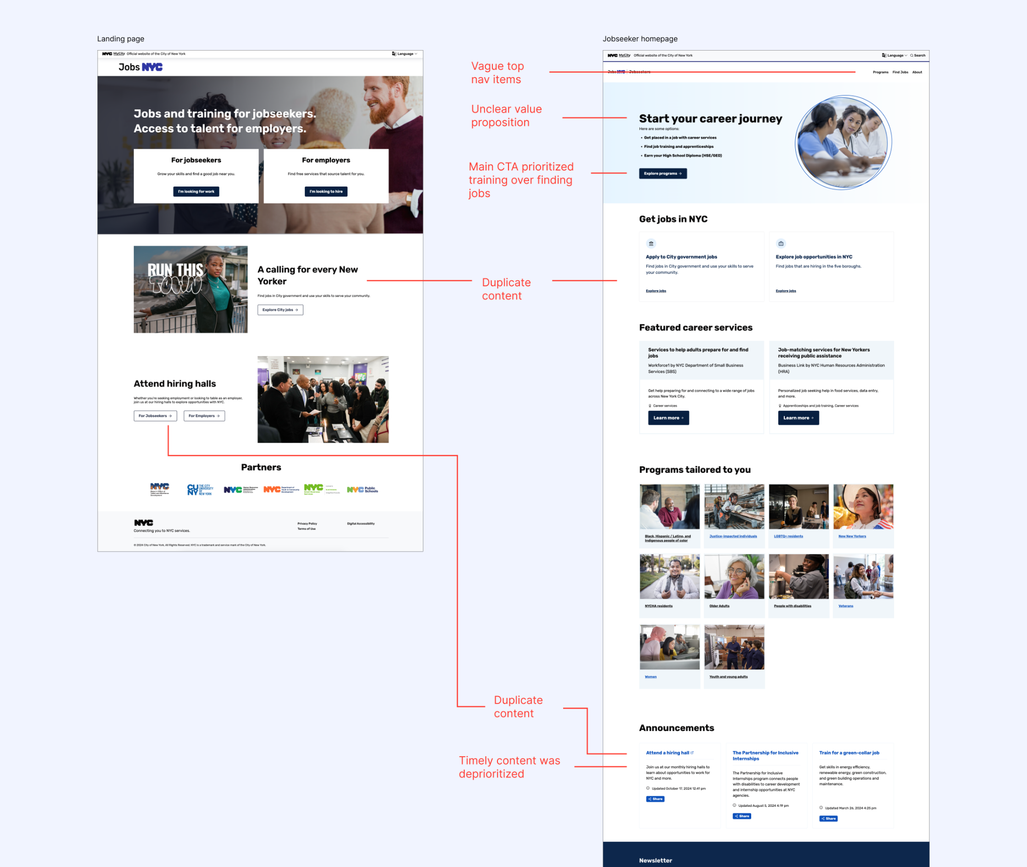
By auditing the site's existing content, I identified opportunities to streamline and organize key content types. These informed the site map and wireframes moving into the content design phase.
Reorganizing the site map and creating low-fidelity wireframes, with real content.
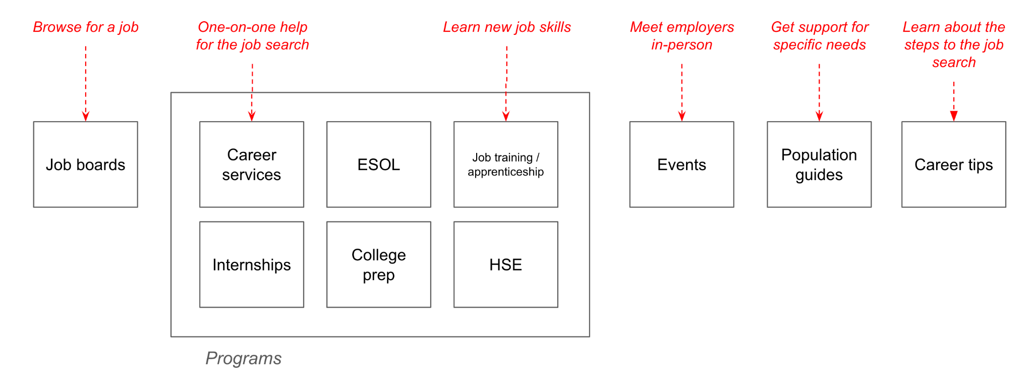
I proposed a simplified site map that reduced the number of pages a user would need to click through.
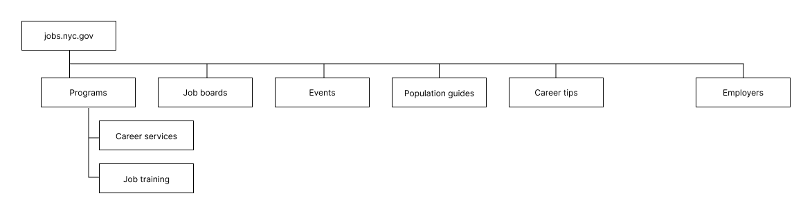
I led workshops to reorganize key content types into discrete sections on the homepage and create action-oriented headings. We moved up the content that guided users to browse jobs and access job services.
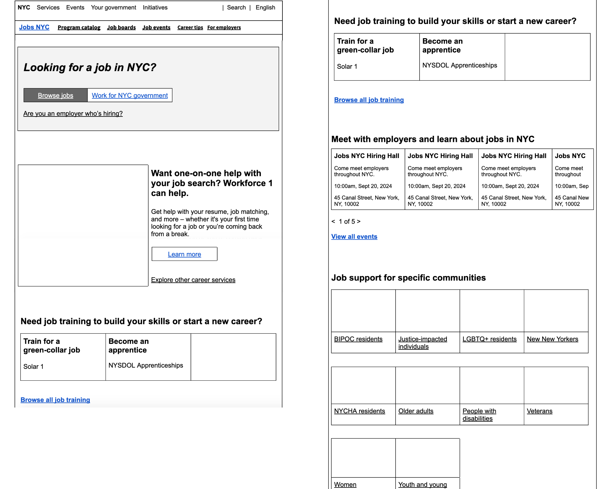
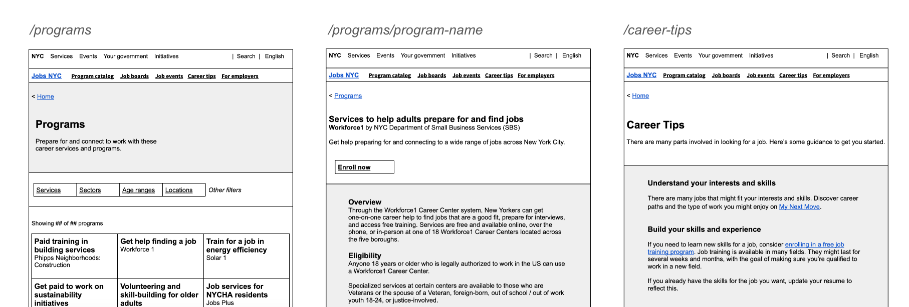
We created wireframes for other key pages, again with real content (all done on Google Docs).
I led demos for the product owners and revised the content and information architecture through 4 rounds of iteration. We also worked with a UX Researcher to user test the content prototype, and made changes based on user insights.
After finalizing the information architecture and UX writing on these wireframes, the team's UX Designer took the designs to high fidelity using the new NYCgov Design System.
The redesign was implemented in December 2025, with promising results.
- Double the users (18.49%, up from 9.14%) clicking the CTA to the job board from the homepage.
- Slight uptake to Workforce 1 (the City's career service)
Post a comment